css-note-1

css-note-1

Charles Lv7

初识CSS

  • CSS声明总是以分号 ; 结束,声明总以大括号 {} 括起来。
1
2
3
4
5
6
7
8
9
10
11
12
13
14
15
16
17
18
19
20
21
22
23
24
25
26
27
<!doctype html>
<html>
<head>
<meta charset="utf-8">
<title>无标题文档</title>
<!-- 这里是外部式的link标记[多用于重复利用]-->
<link rel="stylesheet" href="demo1.css">
<!-- 这里是嵌入式的相关定义-->
<style>
.op{
color: #00ff00;
font-size: 22px;
}
</style>
</head>

<body>
<!-- 内联式-->
<p style="color: red;font-size: 22px">这里是DW相关课程</p>
<!-- 嵌入式-->
<p class="op">这里是DW相关课程</p>
<!-- 外部式(即利用.css文件进行定义-->
<p class="re">这里是DW相关课程</p>
<!-- 三种样式的优先级为内联式>嵌入式>外部式-->
</body>
</html>

1
2
3
4
5
6
7
8
9
@charset "utf-8";
/* CSS Document */

.re{
font-weight: bold;
font-style: italic;
color:blue;
font-size:22px;
}

使用CSS

CSS 是在 HTML 4 开始使用的,是为了更好的渲染HTML元素而引入的.

CSS 可以通过以下方式添加到HTML中:

  • 内联样式- 在HTML元素中使用"style" 属性
  • 内部样式表 -在HTML文档头部 <head> 区域使用<style> 元素 来包含CSS
  • 外部引用 - 使用外部 CSS 文件

最好的方式是通过外部引用CSS文件.

id 和 class 选择器

如果你要在HTML元素中设置CSS样式,你需要在元素中设置"id" 和 "class"选择器。

id 选择器

id 选择器可以为标有特定 id 的 HTML 元素指定特定的样式。

HTML元素以id属性来设置id选择器,CSS 中 id 选择器以 “#” 来定义。

class 选择器

class 选择器用于描述一组元素的样式,class 选择器有别于id选择器,class可以在多个元素中使用。

class 选择器在 HTML 中以 class 属性表示, 在 CSS 中,类选择器以一个点 . 号显示。

盒模型的使用

1
2
3
4
5
6
7
8
9
10
11
12
13
14
15
16
17
18
19
20
21
22
23
24
25
26
27
28
29
30
31
32
33
34
35
36
37
38
39
40
41
42
43
44
45
46
47
48
49
50
51
52
53
54
55
56
57
58
59
60
61
62
63
64
65
66
67
68
69
70
71
72
73
74
75
76
77
78
79
80
81
82
83
84
85
86
87
88
89
90
91
92
93
94
95
96
97
98
99
100
101
102
103
104
105
106
107
108
109
110
111
112
113
<!doctype html>
<html>
<head>
<meta charset="utf-8">
<title>无标题文档</title>
<style>
/* body自带margin和padding*/
body{
margin:0 auto;
padding:0;
}
.nav{
width:100%;
height: 80px;
background-color: #000000;
}
.mid{
width: 100%;
height: 1000px;
background-color: #eeeeee;
padding-top:10px;
}
.center{
margin: 0 auto;
width: 1010px;
background-color: #ffffff;
}
.box1{
float: left;
width:755px;
height: 450px;
background-color:#d8c17e;
}
.box2{
float:left;
width:245px;
height: 280px;
background-color: #535459;
margin-left: 10px;
}
.box3{
float:left;
width:245px;
height: 160px;
background-color: #fdc72e;
margin-left: 10px;
margin-top: 10px;
}
.bigbox{
float: left;
width:1010px;
height: 280px;
margin-top: 10px;
}
.bbox1{
float:left;
width: 245px;
height:280px;
background-color: #d3e1b3;
}
.bbox2{
float:left;
width: 245px;
height:280px;
background-color: #531424;
margin-left: 10px;
}
.bbox3{
float:left;
width: 245px;
height:280px;
background-color: #26467d;
margin-left: 10px;
}
.bbox4{
float:left;
width: 245px;
height:280px;
background-color: #6ba39e;
margin-left: 10px;
}
.bottom{
float: left;
height: 324px;
width: 100%;
background-color: #000000;
}
</style>
</head>

<body>
<div class="nav">

</div>
<div class="mid">
<div class="center">
<div class="box1"></div>
<div class="box2"></div>
<div class="box3"></div>
<div class="bigbox">
<div class="bbox1"></div>
<div class="bbox2"></div>
<div class="bbox3"></div>
<div class="bbox4"></div>
</div>
</div>
</div>
<div class="bottom">

</div>
</body>
</html>

CSS 盒子模型(Box Model)

所有HTML元素可以看作盒子,在CSS中,"box model"这一术语是用来设计和布局时使用。

CSS盒模型本质上是一个盒子,封装周围的HTML元素,它包括:边距,边框,填充,和实际内容。

盒模型允许我们在其它元素和周围元素边框之间的空间放置元素。

下面的图片说明了盒子模型(Box Model):
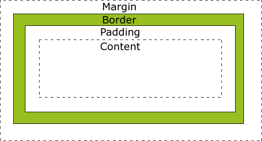
box-model

不同部分的说明:

  • Margin(外边距) - 清除边框外的区域,外边距是透明的。
  • Border(边框) - 围绕在内边距和内容外的边框。
  • Padding(内边距) - 清除内容周围的区域,内边距是透明的。
  • Content(内容) - 盒子的内容,显示文本和图像。

网页布局模型和三种定位

1
2
3
4
5
6
7
8
9
10
11
12
13
14
15
16
17
18
19
20
21
22
23
24
25
26
27
28
29
30
31
32
33
34
35
36
37
38
39
40
41
42
43
44
45
46
<!doctype html>
<html>
<head>
<meta charset="utf-8">
<title>无标题文档</title>
<style>
.box1{
border: 3px solid #00ffff;
width: 100px;
height: 100px;
position:absolute;
left: 30px;
top:100px;

}
.box2{
border: 3px solid #00ff00;
width: 100px;
height: 100px;
position:relative;
left: 30px;
top:100px;
}
.box3{
border: 3px solid #000000;
width: 100px;
height: 100px;
position:fixed;
left: 30px;
top:100px;
}
</style>
</head>

<body>
<!-- 三种网页布局模型:流动布局(flow),浮动布局(float),层模型(layer)-->
<!-- 下面例子为层模型的三种定位-->
<!-- 绝对定位-->
<div class="box1"></div>
<!-- 相对定位_根据自己的父级进行定位-->
<div class="box2"></div>
<!-- 固定定位_根据窗口进行定位【类似弹窗广告,拉动跟随】-->
<div class="box3"></div>
</body>
</html>

CSS Position(定位)

position 属性指定了元素的定位类型。

position 属性的五个值:

元素可以使用的顶部,底部,左侧和右侧属性定位。然而,这些属性无法工作,除非是先设定position属性。他们也有不同的工作方式,这取决于定位方法。

static 定位

HTML 元素的默认值,即没有定位,遵循正常的文档流对象。

静态定位的元素不会受到 top, bottom, left, right影响。

1
2
3
4
div.static {
position: static;
border: 3px solid #73AD21;
}
fixed 定位

元素的位置相对于浏览器窗口是固定位置。

即使窗口是滚动的它也不会移动:

1
2
3
4
5
6
p.pos_fixed
{
position:fixed;
top:30px;
right:5px;
}
relative 定位

相对定位元素的定位是相对其正常位置。

1
2
3
4
5
6
7
8
9
10
h2.pos_left
{
position:relative;
left:-20px;
}
h2.pos_right
{
position:relative;
left:20px;
}

相对定位元素经常被用来作为绝对定位元素的容器块。

absolute 定位

绝对定位的元素的位置相对于最近的已定位父元素,如果元素没有已定位的父元素,那么它的位置相对于<html>:

1
2
3
4
5
6
h2
{
position:absolute;
left:100px;
top:150px;
}
  • absolute 定位使元素的位置与文档流无关,因此不占据空间。

  • absolute 定位的元素和其他元素重叠。

sticky 定位

sticky 英文字面意思是粘,粘贴,所以可以把它称之为粘性定位。

position: sticky; 基于用户的滚动位置来定位。

粘性定位的元素是依赖于用户的滚动,在 position:relativeposition:fixed 定位之间切换。

它的行为就像 position:relative; 而当页面滚动超出目标区域时,它的表现就像 position:fixed;,它会固定在目标位置。

元素定位表现为在跨越特定阈值前为相对定位,之后为固定定位。

这个特定阈值指的是 top, right, bottom 或 left 之一,换言之,指定 top, right, bottom 或 left 四个阈值其中之一,才可使粘性定位生效。否则其行为与相对定位相同。

1
2
3
4
5
6
7
div.sticky {
position: -webkit-sticky; /* Safari */
position: sticky;
top: 0;
background-color: green;
border: 2px solid #4CAF50;
}
CSS定位属性
属性 说明 CSS版本
bottom 定义了定位元素下外边距边界与其包含块下边界之间的偏移。 auto
length
%
inherit
2
clip 剪辑一个绝对定位的元素 shape
auto
inherit
2
cursor 显示光标移动到指定的类型 url
auto
crosshair
default
pointer
move
e-resize
ne-resize
nw-resize
n-resize
se-resize
sw-resize
s-resize
w-resize
text
wait
help
2
left 定义了定位元素左外边距边界与其包含块左边界之间的偏移。 auto
length
%
inherit
2
overflow 设置当元素的内容溢出其区域时发生的事情。 auto
hidden
scroll
visible
inherit
2
overflow-y 指定如何处理顶部/底部边缘的内容溢出元素的内容区域 auto
hidden
scroll
visible
no-display
no-content
2
overflow-x 指定如何处理右边/左边边缘的内容溢出元素的内容区域 auto
hidden
scroll
visible
no-display
no-content
2
position 指定元素的定位类型 absolute
fixed
relative
static
inherit
2
right 定义了定位元素右外边距边界与其包含块右边界之间的偏移。 auto
length
%
inherit
2
top 定义了一个定位元素的上外边距边界与其包含块上边界之间的偏移。 auto
length
%
inherit
2
z-index 设置元素的堆叠顺序 number
auto
inherit
2

元素的分类

1
2
3
4
5
6
7
8
9
10
11
12
13
14
15
16
17
18
19
20
21
22
23
24
25
26
27
28
29
30
31
32
33
34
35
36
37
38
<!doctype html>
<html>
<head>
<meta charset="utf-8">
<title>无标题文档</title>
<style>
.demo{
width: 50px;
height: 50px;
background-color: aqua;
line-height: 20px;
}
img{
width:100px;
height:160px;
}
/* display可以将对象设置为block-块状元素,inline-内联元素,inline-block-内联块状元素*/
span{
display: block;
width:200px;
}
</style>
</head>

<body>
<!-- 块状元素-->
<div class="demo"></div>
<p class="demo"></p>
<h2 class="demo"></h2>
<!-- 内联元素-->
<span>我是span标签 </span>
<strong>我是strong标签 </strong>
<!-- 内联块状元素-->
<img src="../https://charles2530.github.io/image/Stephen curry.jpg" alt="">

</body>
</html>

CSS Display(显示) 与 Visibility(可见性)

  • display属性设置一个元素应如何显示,visibility属性指定一个元素应可见还是隐藏。
隐藏元素 - display:none或visibility:hidden

隐藏一个元素可以通过把display属性设置为"none",或把visibility属性设置为"hidden"。但是请注意,这两种方法会产生不同的结果。

visibility:hidden可以隐藏某个元素,但隐藏的元素仍需占用与未隐藏之前一样的空间。也就是说,该元素虽然被隐藏了,但仍然会影响布局。

1
h1.hidden {visibility:hidden;}
display改变一个元素显示

display:none可以隐藏某个元素,且隐藏的元素不会占用任何空间。也就是说,该元素不但被隐藏了,而且该元素原本占用的空间也会从页面布局中消失。

1
h1.hidden {display:none;}

可以更改内联元素和块元素,反之亦然,可以使页面看起来是以一种特定的方式组合,并仍然遵循web标准。

下面的示例把列表项显示为内联元素:

1
li {display:inline;}

下面的示例把span元素作为块元素:

1
span {display:block;}
  • Title: css-note-1
  • Author: Charles
  • Created at : 2022-12-29 10:48:49
  • Updated at : 2023-08-18 09:14:15
  • Link: https://charles2530.github.io/2022/12/29/css-note-1/
  • License: This work is licensed under CC BY-NC-SA 4.0.
Comments